This was once an unlisted page, not intended for the general public. The persons for whom this page was intended were:
- USPTO people
- alpha testers of Patent Center
- Oppedahl Patent Law Firm LLC people
- others to whom Carl has provided this URL.
Now I have made this page public. It provides historical perspective on what some of my concerns were about Patentcenter back in September of 2018.
Saved submission that disappeared. This is a scary one. I was working on filing a provisional. I clicked “save”. Across the top of the page it said it had saved the submission. So then I canceled the project and went back to “home” and went into my saved submissions. There was no saved submission.
File that makes Patentcenter puke. I uploaded this file aia0082v323jul2013 and it generated an error “501 internal server error” and then I did not get any opportunity to select a document description. Oddly despite this the system permitted me to proceed with continuing to paying fees and even trying to submit. At that point the system finally refuse to submit, saying that I should have provided a document description. I reported this to Jay with ticket number 1618708586.
Can’t enter US national phase from a PCT. I tried to enter the national phase from a PCT. The system gave me an error “500 internal server error”. The EBC reproduced the error with ticket number 1-618630498 per Harvey.
Broken e-signature block. 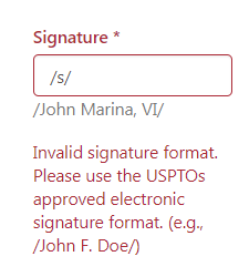 I entered a virgule signature that is compliant with 37 CFR § 1.4 but the system incorrectly said it was invalid. This will need to be corrected in the system.
 Broken issue fee page. Trying to do an online issue fee payment. Adding an Assignee. If the assignee is in China, it tries to force me to pick a state/province. The only choice in the drop-down list is “Tibet”. Then the way it renders on the screen is “54” which makes no sense. Oddly, the PDF that eventually gets rendered somehow is free from error.
Defect if there is an embedded font. I upload a drawing with an embedded font. One odd consequence is that it then becomes impossible to delete the file from the submission package. (There is a workaround. You save the submission and reopen it and then you can delete the file.) Anyway then I print it to CutePDF and I upload the drawing again. That’s fine, except then the system does not actually ask me to provide a document description. Then I click through the fees and try to submit and the system gripes that I never provided a document description.
The only way I was able to make the problem go away was to go way back and delete the file with the embedded font (by saving the submission and then reopening it and deleting it) and then deleting the file that lacked a document description, and then uploading that file all over again, and this time the system permitted me to give it a document description.
We filed a US provisional application. Why does PC not mention the possibility of using a Form SB/16 – provisional cover sheet?
Why does PC not provide a web-based ADS?
There’s an awkward sequence of steps after I upload my stuff, like whether I do or do not want to pay my filing fee.
When I am all done I cannot click to send an email as I would in EFS-Web.
Why not provide a link to go straight to the workbench page for this application?
There is a nice touch – if I do a search for an application and it fails, it saves the failed search and I can search again with one mouse click. Pair does not do that, it forces me to go find the application number and enter it again.
We filed a patent application. Micah in our office filed a patent application. USPTO has not yet given him the ability to actually log in, so he was forced to do the entire e-filing as a “guest” in Patent Center. Here are his comments.
Drag and drop for ADS only works if you manage to hit a very tiny target. Drag and drop for upload documents never actually worked.
When we did file selection, we were delighted to see that we were able to select multiple files and they all uploaded.
The system auto-populated some of the document descriptions and each one was a correct guess.
“No going back”. Once we picked one of the three ADS selections, it was locked in and it was impossible to go back and pick a different ADS selection.
No preview function for the ADS once we uploaded it. Yes it did render the ADS but we were not able actually to view the PDF ADS.
For the preview of the uploaded documents it looked goofy with a lot of the page grayed out.
The drawings got described as if they were “design drawings” even though this was a utility filing.
Micah’s overall impression was that for a new user the e-filing path in Patent Center as a guest user was probable an easier learning curve than for the same new user in EFS-Web as a non-logged-in user.

“Display references” doesn’t work. It is recalled that PAIR has a way to download cited US patent references. So of course I need to do the same thing in PC. In PC, for a particular application I click on “Display references”. I then pick a Form 892 (references cited by Examiner). It cites three US patent documents. (See screen shot at right.) I try clicking on the all-seeing eye icon. A new window pops up but it is blank. There is a “quick download” column with “PDF” under the heading. I click on “PDF”. It is not restful, by which I mean it is not possible to right-click and open it in a new page. So reluctantly I click on it. The page is blank and the URL starts with a nonsense “blob” data type. To the right I try checking a box and then selecting “download a PDF”. Same problem. a page with a nonsense “blob” data type and an otherwise blank page.
How am I supposed to display the references?
Submission receipt? Payment receipt? In the application list are two sticky columns (I can’t seem to get rid of them) called submission receipt and payment receipt. If I click on the creepy eyeball for either column I get an error message “403 Forbidden – You do not have sufficient privileges to perform that action”.
Can’t sort by filing date? In Private PAIR I will often select applications for a particular customer number and sort them by filing date. But I can’t seem to do that in PC. Oh I see. I can click on three dots and then I can pick the columns to be displayed. And then I can sort.
I wonder if this is persistent. If I log out and log back in, will the column selection be preserved? Will the sort order be preserved?
Non-identical IFW between PAIR and PC. I look at US application number 15/360,904. In PAIR there are documents in IFW dated today September 13. A petition decision. But in PC in the IFW, the most recent document is dated May 4. This is very very bad that the IFW would be non-identical in the two systems.
“Sponsor users” does not work well. I decide to sponsor a user. To eliminate any question as to whether I am entering the user’s email address correctly into PC, I obtain the user’s email address by logging in at Financial Manager and copying and pasting the email addresses of my office colleagues from Financial Manager into PC. This absolutely guarantees that each of these persons really does have a My USPTO user ID and password. And yet PC scolds me with a big red error message:
Patent Center cannot add the below email address(es). Please ensure the email address(es) are correct and the paralegal(s) have a Patent Center account. If they don’t have an account, first obtain a Patent Center account and try adding later.
Maybe the stinker here is that somehow a Financial Manager account is not the same as a Patent Center account? If so, then this is a big problem.
“Correspondence” doesn’t work. I click on the link “Correspondence” and it does nothing. If I right-click to open in a new window it opens in a new window that looks just like the home screen of PC.
News flash. The workaround is to click on “workbench” in the blue bar and then wait quite a while for a new page to render and then click on a “correspondence” tab. And then wait a very long time with no hourglass but eventually a new page will render with the correspondence.
“Manage customer numbers” doesn’t work. I click on the link “Manage customer numbers” and it does nothing. If I right-click to open in a new window it opens in a new window that looks just like the home screen of PC.
News flash. The workaround is to click on “manage” in the blue bar and then wait quite a while for a new page to render and then click on a “manage customer numbers” link. And then wait a very long time with no hourglass but eventually a new page will render with the customer numbers.
“Manage application address” doesn’t work. I click on the link “Manage application address” and it does nothing. If I right-click to open in a new window it opens in a new window that looks just like the home screen of PC.
The workaround that I thought might work does not work. I click on “manage” in the blue bar and then wait quite a while for a new page to render and then click on an “update application address” link and it does not go anywhere.
“Sign in using your credentials” doesn’t work. I can’t ever seem to log in on the “sign in using your credentials” page. If I click on “sign in” and go to the new page and fill in my user ID and password and check the “I certify” box and click the big blue “sign in” button … nothing happens. Click the big blue “sign in” button again … still nothing happens.
The workaround is to click on “home” and click on “nonprovisional” and a pop-up warning box will have a “login” link that will permit me to log in. (This is the login path that actually works, and it is the login path that tells me I must use Oracle Mobile Authentication.) See next.
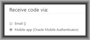 Telling users they must use an Oracle-branded piece of software. One of the click paths for logging in at Patent Center reaches a screen that tells the user that they must use Oracle Mobile Authenticator. This needs to be corrected.
Where are “Applications with Status Changes”? This is an important feature in Private PAIR. I can’t figure out where it is in PC. (This is feature request FR3.)
 No partial docket number? In Private PAIR on the main screen I can search on partial attorney docket number. This feature seems to be gone in PC. I do see that there is a two-step click path (workbench and then Application) that will permit me to search on a partial attorney docket number. But not on the main screen. On the main screen, the “docket number” search will fail unless I somehow manage to type the entire document number errorlessly including all punctuation marks. I am pretty sure that the way things now stand, no user will ever even once successfully make use of the “Attorney Docket #” search on the main page.
First office action prediction? Where is the first office action prediction? This is an important feature in Private PAIR. I cannot find it in PC.
All-or-nothing sponsoring. As best I can see, the result of “sponsoring” is that the sponsored person can see everything that I can see. This is nuts, of course. In ePCT I get to pick who gets to see what. I can permit a first client to see the files for that first client, and I can permit a second client to see the files for that second client. But in Patent Center as far as I can tell the only choice is to show somebody every file in my workbench. Nuts. ePCT got it right, so can you.
All sponsors are paralegals? Somebody at USPTO seems to have gotten the idea that each person who works for me must necessarily be a paralegal. That’s just not true. But the screen calls all sponsored persons paralegals. A person working for me might be an attorney or a secretary or patent agent for example.
Follow-on submission screen confirmation number arrows. The screen for doing a follow-on submission has two entry boxes — a first box for the application number and a second box for the confirmation number. Astonishingly, some programmer has designed the confirmation number box with scroll arrows up and down, as if I might wish to scroll up or down starting at 0000 and working my way up to 0001 and then 0002 and eventually up to the number that I want (in this case 2344). That is nuts. Let’s get rid of the up and down arrows.
Deep link from application page to follow-on page. Ten years ago I sat in a USPTO conference room with Jeff Wong and Huong Esposo and asked for a deep link on each application page which would bring up an e-filing page for that application. The idea is that I would not have to laboriously copy and paste both the application number and confirmation number from one screen to another to do a follow-on submission. Now ten years have passed and we have Patent Center. What happened to this request which I presented in person? You need to provide the deep link that I asked for ten years ago. ePCT does it, and so can you.
No EFS-Web action parity. I thought you folks had a goal of action parity. Any action that could be done in EFS-Web could be done in Patent Center. Today I wanted to pay an Issue Fee. In EFS-Web I would simply click on an action button and fill in a couple of blanks and EFS-Web would auto-generate a substitute Form 85B. But there is nothing like that in Patent Center, not that I was able to find. So I had to do it the old-fashioned way, using a typewriter to type information onto a PDF 85B. See next comment on how poorly PC handled even that submission.
PC pukes on PDF with typewriter text, pussyfoots around on whether it will accept it, wrongly says document description is no good. If I am paying an Issue Fee in EFS-Web I can use the Acrobat typewriter tool to type the answers onto Form 85B. I can type the firm name and the assignee name and the signature. EFS-Web will accept it and it will flow without mishap into IFW.
In contrast if I upload such an 85B into PC, it pukes. It says rather vaguely:
The attached file contains comments or annotations. Comments are not recommended and may cause processing problems with the document.
Does this mean I cannot click submit? Apparently not. The message only says “not recommended”.
But eventually when the time came to click submit, the system super-puked, saying:
All files which have generated error messages must be removed from this submission before you may proceed.
A document description must be chosen for each attached file.
There was nothing wrong with the document description. So that error message was spurious. And now for the first time, PC fessed up that the PDF with typewritten text was not merely “not recommended” but was in the category of “must be removed”.
There are at least three problems here.
First, if EFS-Web did not think there was ever a problem with a PDF with typewritten information on the page, why this newfound puking behavior with PC?
Second, why pussyfoot around about this? If at the end of the process when the user tries to click submit you are going to say “must be removed” then at document attachment time you should not merely say “not recommended”. At document attachment time you should come out and say it if you are going to refuse it.
Third, why say there is a problem with the document description when in fact there is nothing wrong with the document description?
Oh and my way of faking out PC was to print this PDF to CutePDF. Then I re-uploaded it to PC and PC was tricked into thinking I had not typed any information onto the PDF page. Silly that I should have to go to this extra step.
Impossible to delete document. 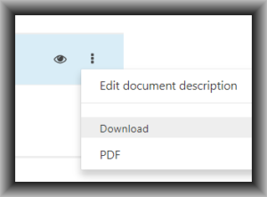 When I realized I needed to delete the PDF from the “upload documents” page, I found that it is impossible to delete it from the list of documents that are going to be uploaded. See the screenshot. I can edit the document description. I can download the document. And I can PDF the document, which as far as I can see is exactly the same thing as downloading the document. I can’t see why those two things are listed as separate things.
But anyway, it is impossible to delete a document from the list of documents to be e-filed. In this case I had to give up and start a whole new submission package.
Easter eggs. One of the most evil things in user interface design is Easter eggs, meaning things that you can’t see. And the most evil Easter egg is some super important thing that you need to be able to do and there is no visual cue on the screen as to where to click to make it happen. You have to already know it is there and hover your cursor over it, and the invisible thing becomes visible. The box above that contains “edit document description/download/PDF” is such an Easter egg. You would never know it is there until you hover your cursor over that part of the screen.
As I sit here I imagine there are a dozen or more hidden features of PC that lurk behind Easter eggs.
Yeah, I know, read the manual. Probably the user documentation says “hover your mouse approximately four inches to the right of the document description and it will display an action box that lets you download the file”. Forget it. Anything that appears only because of a “hover over” activity needs to be made constantly visible.
(Blog article about Easter eggs.)
Document description very clunky. In EFS-Web for document descriptions there were two drop-down boxes side by side. The first one was for some general categories of documents. If you were to pick one category then you could go to the second drop-down box and it would have a short list of documents in that category. Clunky but it worked more or less. I never use the first drop-down box. I always just use the second drop-down box and quickly use a letter of the alphabet to select a document description from the second list. If I want “claims” I type “d” and then scroll up a couple of positions to “claims”.
In PC, somebody has gotten way too smart and has tried to smash both drop-down functions into one strange box that is not responsive to a key stroke at all and can only be manipulated, if at all, by clunky mouse movements. It seems to be one of those nasty things using Ajax or Javascript or something that is very dependent upon the processor speed of the user’s web browser so that one cannot predict just how long the cursor will have to be in a particular place to trigger a category to get selected for further drilling down to a particular document description. Nasty. Certainly not ADA compliant and super unfriendly to a user with any muscle tremor or fine-motor-control issues in their hands.
Forced logouts and timeouts. Users have made their wishes clear as may be seen in this survey. Forced logouts are the enemy. During our training two weeks ago it was represented that USPTO was going to make it that the forced logout would only be for user ID and password, but the successful entry of the TOTP would last all day. Today, however, I was on the receiving end of a forced logout after only about twenty minutes and to log back in I had to do everything including the TOTP. This is not good.

