The Patentcenter developers continue to violate their own rules about how filers are supposed to format their documents. They do not just violate their own rules a little. They violate their own rules big time. The violations by the Patentcenter developers make life more difficult for applicants because it makes acknowledgement receipts nearly unreadable in IFW. (The Image File Wrapper (IFW) is a date-stamped, electronic record of the documents in the file and it is the primary source for viewing the entire history of a patent application. Integrity of IFW is essential.) The violations by the Patentcenter developers make life more difficult for the filer of a third-party submission of prior art, because by the time the Examiner sees the third-party submission, it is nearly unreadable in IFW. It means the Examiner is unlikely to give full consideration to the third-party submission.
By way of background, the USPTO warns practitioners and applicants that they are not supposed to upload documents that contain color or gray scale. The reason, of course, is that the USPTO system is extremely poorly designed, and it usually ruins the documents if they contain any color or gray scale. There are intelligent ways to handle submissions containing color and gray scale, and the USPTO failed to do any of those intelligent things in EFS-Web. The alpha testers of Patentcenter (including me) begged the Patentcenter developers over and over again to avoid making the same mistakes in Patentcenter as they made in EFS-Web regarding the handling of uploaded documents containing color and gray scale. The begging fell upon deaf ears. All of the same user interface design mistakes that the developers made in EFS-Web were methodically replicated exactly in Patentcenter, including the halftoning of all color and gray scale which leads to substantial blurring of any material that was originally in color or gray scale. The alpha testers of Patentcenter (including me) begged the Patentcenter developers over and over again to please go and look to see how WIPO handles this in ePCT. In ePCT, if an uploaded document contains any color or gray scale, the system notices this and warns the filer that this might lead to degradation of image quality. The filer is invited to “preview” the document so that the filer can see exactly how the document would be modified by the ePCT system if the filer were to proceed. This permits the filer to make an informed decision, before it is too late, as to whether to proceed or whether to attempt to edit or modify the document to reduce the degradation that would result. The alpha testers of Patentcenter (including me) begged the Patentcenter developers over and over again to provide a similar preview function.
What really happened, despite the begging, is that the Patentcenter developers ignored this, and instead replicated the misleading “fake preview” function from EFS-Web. In the “fake preview” function, what happens is the Patentcenter offers up to the user the exact same document that the user uploaded, and it gets displayed with an extremely accurate rendering of all color and gray scale. The result is that the user is misled into thinking that the document will look just fine after the user clicks “submit”. The real result, however, is that the USPTO system usually ruins the document and makes it unreadable, but this harm is disclosed to the filer only after the user clicks “submit” and then only after the user goes to look in IFW to see what is visible there.
How may a user avoid these problems that the USPTO system ruins uploads that contain gray scale or color? Users learn the answer the hard way, through unhappy experience. Eventually a user learns that the only way to avoid these problems is to take extreme care to ensure that every pixel in every image being uploaded is a pixel that is either pure black or pure white.
In geek speak, the color of a pixel can be described in any of several different ways. If a pixel is a pure black and white pixel, then using binary digits of 0 and 1, we can use a single “bit” (binary digit) that is a zero or one to communicate the black or white color. An image in which every pixel is either pure black or white might thus be encoded as “one bit per pixel”. Another way to use words to describe such an image is to say that “it has a color depth of two”. When we say “color depth of two” we mean there are only two choices for the color of the pixel. In geek speak, we can say that “one bit per pixel” means the same thing as “color depth of two” which also means “each pixel is either pure black or pure white”.
In a so-called “gray scale” image, it is customary to define each pixel as having a color that falls on a scale of 256 (decimal) possible colors, with pure black at one end of the scale and pure white at the other end of the scale. The colors in the middle are 254 shades of gray. People who play with binary numbers a lot immediately recognize that it takes eight bits to do this. So in geek speak we might say that “eight bits per pixel” works out to the same thing as “gray scale”.
Back when these things were first getting established in the world of computer screens and printers, it would have been possible to imagine defining black as 255 and white as 0, or on the other hand defining white as 255 and black as 0. Another way to say this would be that back in those early days, everybody could have gotten together to agree that bigger means brighter or that bigger means darker. The way it actually worked out is that everybody settled upon bigger numbers meaning whiter. So in the world of computer images that get uploaded during e-filing processes, the convention is that white is decimal 255 and black is 0.
The next bit of background that I must provide is how colors are communicated in the world of computer displays and printers. A typical way of communicating color is to assume that any particular pixel has particular “amounts” of red, green, and blue in the pixel. The “amount” of red in the pixel is communicated by a first decimal number in the range of 255 to 0. The “amount” of green in the pixel is communicated by a second decimal number in the range of 255 to 0. The “amount” of red in the pixel is communicated by a third decimal number in the range of 255 to 0. This means that there are “24 bits per pixel”.
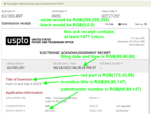
Now we reach the part of this blog article where I describe a way that the Patentcenter developers violate their own rules in a very serious way. Look for example at the Acknowledgment Receipt (“ack receipt”) quoted above. In that ack receipt, the developers chose to use a red color for some of the important information, for example the “title of the invention”. The geek-speak way to describe the shade of red that the developers selected is 173, 43, 55. The 173 indicates how much red is in the pixel, and the 43 and 55 indicate how much green and blue, respectively, are in the pixel.
Again, by way of background information, a pure white pixel on the screen would be 255,255,255 and a pure black pixel on the screen would be 0,0,0.
For the Patentcenter developers to avoid violating their own rules, they would have to make each pixel either 255,255,255 or 0,0,0. Only two choices are correct (pure black or pure white) according to USPTO’s own rules about uploaded documents. Instead, the ack receipt shown above contains at least 1477 distinct colors.
Perhaps the most evil choice made by the developers was to make nearly all of the really important information in the ack receipt a sort of faint shade of gray. The so-called “Patent Center number” which might be needed later for an applicant to prove that they did indeed e-file something, is in a shade of gray that is 68, 68, 147. The filing date and time is in a different shade of gray that is 68, 68, 68. You can see this in the quoted image above.

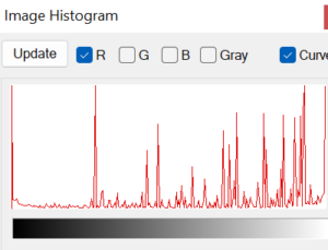
To get a sense of how weirdly and seemingly randomly the Patentcenter developers picked their colors for various pixels in the ack receipt, you can look at this histogram for the redness content of pixels in this part of the ack receipt. The graph should be exactly bimodal, with the amount of redness being either “all the way on” or “all the way off”. That would mean two peaks, one at the left edge of the histogram and one at the right edge, with the center area being perfectly flat at zero. Instead you can see lots of peaks indicating large numbers of pixels with various seemingly random amount of redness in them.
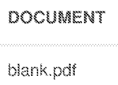
 Now we get to go and look in IFW to see what actually ended up there after Patentcenter did its halftoning of the pixels that were not pure black or pure white. Here you see a file name that is very fuzzy. You can sort of make out that it says “blank.pdf” but it is fuzzy. If the Patentcenter developers had made the ack receipt with a color depth of 2 (pure black and white) then this file name “blank.pdf” would be clearer and easier to read.

Here is part of the ack receipt that is even harder to read, again because the Patentcenter developers made this text in a shade of gray which then got halftoned.

These bad choices by the Patentcenter developers do not only harm applicants that want to be able to read their ack receipts. These bad choices by the Patentcenter developers harm members of the public who try to do third-party submissions (TPSs) of prior art. One of the things that you are forced to do, if you want to make use of the TPS system, is to use a web-based form within Patentcenter. In the form, you are required to explain the relevance of the prior-art reference being cited. You might type into the form a line of text such as “the limitation in line 2 of the claim may be found at page 3 of the cited reference”. Unfortunately, the Patentcenter developers render such a line of text in a faint shade of gray, and by the time it reaches the Examiner it is unreadable. Quoted at right is a real-life example of the harm caused by the bad choices made by the Patentcenter developers. The text that is supposed to help the Examiner appreciate the relevance of the cited reference has been half-toned nearly out of readability.
This vitiates the TPS process.
What corrective actions are needed on the part of the Patentcenter developers?
- The Patentcenter developers need to correct their color-selection mistakes in the various web-based forms that get loaded into IFW. Every web-based form created by Patentcenter needs to comply with USPTO’s own rules, with each pixel being either pure black or pure white. The Patentcenter developers were told of these design mistakes two years ago, and have not corrected the mistakes. The developers need to listen now and respond by eliminating color and gray scale from the web-based forms.
- The Patentcenter developers need to provide a preview function so that the filer can see what harm would befall an uploaded document if the filer were to click “submit”. EPAS provides such a preview. ETAS provides such a preview. ePCT provides such a preview. The Patentcenter developers were told of this failing back in 2018 by the alpha testers (including by me). Now, three years later, the Patentcenter developers need to listen and respond by providing the preview function.

Even better – the tools the PTO recommends generate text-based PDFs (not image based). The text is there, absolutely faithfully. It coud be green-on-green for all we care—the text is 100% there.
Then the PTO throws it away and converts to bitmap.
That’s the origin of the problem. From that dumb starting point, there is no solution that’s really good.
Something else I just noticed: the acknowledgement receipts are signed PDFs, but the PTO is using a certificate that expired on September 26, 2019.
The downloadable DOCX templates that the USPTO provides on its DOCX guidance page also use color (blue headings). Would it be too optimistic to hope that they are planning to upgrade the software used to render documents into the image file wrapper (IFW) to show color?