 Today is the day that the Brazilian industrial property office has added two more kinds of participation to its connections with the DAS system. Continue reading “Brazil industrial property office becomes more trendy, modern, and up-to-date”
Brazil industrial property office becomes more trendy, modern, and up-to-date
A week from now, the Brazilian industrial property office will become even more trendy, modern, and up-to-date than it already is. It will become an Accessing Office in the DAS system for two more kinds of priority document. Continue reading “Brazil industrial property office becomes more trendy, modern, and up-to-date”
What reel and frame numbers have to do with bitcoin and blockchain and shared ledgers
For their entire careers, US patent and trademark practitioners have lived and breathed a world of “reel and frame numbers” that are somehow intimately connected with the recordation of patent and trademark assignments. What exactly are reel and frame numbers, and how is it that reel and frame numbers relate closely with bitcoin and blockchain and shared ledgers? Continue reading “What reel and frame numbers have to do with bitcoin and blockchain and shared ledgers”
A reminder about training material for DO/EO/US
On December 10, 2019 I provided training material to the USPTO (blog article, training material) about PCT Declaration Number 4. The idea is that a patent firm located outside the US might be trendy, modern, and up-to-date and might provide a signed inventor declaration (for later US purposes) at the time of filing a PCT application. The idea is that perhaps 1½ or 2½ years later, when the US national phase is entered, the signed declaration of inventorship for US purposes would already be in the file! The idea is that the formalities examiner in the DO/EO/US would take a look in the file and would pay attention to the presence of the signed PCT Declaration Number 4.
Unfortunately, all too often in recent months, we have had cases at the DO/EO/US where the formalities examiner at the USPTO fails to pay attention to the presence of the signed PCT Declaration Number 4 in our national-phase entry application file. Just today, for example, in one of our national-phase entry applications, the formalities examiner at the USPTO mailed out an official Filing Receipt along with Form PCT/DO/EO/903 (371 Acceptance Notice) dated July 17, 2023 falsely stating that we had failed to provide a “properly executed inventor’s oath or declaration” for our inventor.
It is hoped that the USPTO will once again in 2023 provide the training materials to its DO/EO/US formalities examiners, so that they can avoid making this mistake in the future for other US national-phase applicants.
How to choose which subject for binge-watching?
PCT enthusiasts now have two subjects to choose from for binge-watching. Just today I finished the video editing of the sixteenth webinar in the recently finished sixteen-webinar series on ePCT. As a consequence, as of today, a PCT enthusiast may, if desired, binge-watch more than nineteen hours of webinar video about ePCT. (You can see it here.)
This parallels the over fourteen hours of webinar video about PCT (as distinguished from ePCT) that are available for binge-watching here. Yes, the PCT enthusiast has not one but two subjects available for binge-watching.
Italian patent and trademark office — soon to be more trendy, modern and up-to-date
![]() On October 1, 2020 (blog article) the Italian patent and trademark office joined the DAS system. It became a Depositing Office in the DAS system for the following kinds of applications:
On October 1, 2020 (blog article) the Italian patent and trademark office joined the DAS system. It became a Depositing Office in the DAS system for the following kinds of applications:
-
- national industrial design applications
- national patent applications
- national trademark applications
- national utility model applications
- PCT international applications
On September 1, 2023, the Italian patent and trademark office will become an Accessing Office in the DAS system for these same kinds of applications. This is, of course, a very exciting development for the Italian patent and trademark office and for the DAS system.
Will the attached assignment be acceptable to the USPTO?
About once a month we at OPLF get an inquiry from an intellectual property firm located outside of the US regarding a client’s name change or assignment. The inquiry is along the lines of:
Here is a draft Assignment from Company A to Company B. Kindly advise whether this Assignment will be acceptable to the USPTO to transfer patent C from Company A to Company B. Kindly advise what other documents if any will be needed and what this will cost.
Or the inquiry is along the lines of:
Here is an excerpt from the official corporate register of country A evidencing that the Company has officially changed its name from A to B. Kindly advise whether this document will be acceptable to the USPTO to change the applicant name from A to B. Kindly advise what other documents if any will be needed and what this will cost.
We find ourselves having to explain the same things, over and over again, to non-US counsel. We hope that with this blog article we can save some time for everybody involved and answer some of the questions. Continue reading “Will the attached assignment be acceptable to the USPTO?”
What is an EVSE and why do we care?
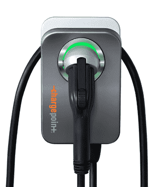 What is the device shown in the photograph at right? My quick answer, and you might say the same thing, is that it is “an EV charger”. But my quick answer is wrong. The device shown at right is a mere “EVSE”, not an “EV charger”. This fact, it turns out, explains why a Hyundai Kona charges at a mere 26 miles per hour, when plugged into this 48-amp device, instead of as much as 42 or 43 miles per hour the way some other EV might do. See a blog article about this.
Which GL.iNet routers provide VLAN wifi client isolation?
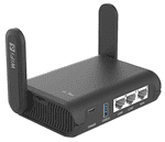 The question presented (and answered) here is “which GL.iNet routers provide VLAN wifi client isolation?” This is likely to be of interest to those who want to set up VLAN protection in their home or small office local area network. The idea would be to relegate relatively untrusted IOT (internet-of-things) devices to a separate VLAN from the main VLAN of trusted devices, but in addition, to isolate the untrusted IOT wifi clients from each other. On this page you can see the results of my actual testing as to which GL.iNet routers provide this isolation feature, and which do not.
Today is the day — Lithuanian patent office and the DAS system
 Today is the day that the State Patent Bureau of the Republic of Lithuania becomes even more trendy, modern and up-to-date. Today is the date that the Lithuanian patent office commences participation in the DAS system in four ways:
-
- as a Depositing Office for purposes of national industrial design applications,
- as a Depositing Office for purposes of national trademark applications,
- as an Accessing Office for purposes of national industrial design applications, and
- as an Accessing Office for purposes of national trademark applications.
You heard this exciting news from me first, in my blog posting of May 4, 2023.
The Lithuanian patent office has already been a participant in the DAS system since January 1, 2023 in these ways:
-
- as a Depositing Office for purposes of national patent applications;
- as an Accessing Office for purposes of national patent applications; and
- as an Accessing Office for purposes of PCT patent applications.
The two-letter code (ISO-3166 code) for this Office is “LT”. The web site of the Lithuanian patent office may be seen here.