
Today the USPTO rolled out its “modernized look and feel” version of Patentcenter. It contains lots of new content-free “icons” that take up valuable screen space, wasting pixels and forcing users to scroll further down to reach what they need.
On March 10, 2023 the USPTO announced (archived here) that seven days later (today, as it turns out) the USPTO would roll out “an updated interface [for Patentcenter] with an improved look and feel to enhance and modernize the customer experience.” In an earlier blog article I pointed out a “boundary value” programming mistake in today’s “modernized look and feel” version of Patentcenter. The Patentcenter page that day-to-day users visit most often (outgoing correspondence) lists a “page 2 of 1”.
In this blog article I describe a user interface blunder — the insertion of content-free and space-taking “icons” that force users to scroll way down to reach links that used to be “above the fold”.
The use of icons to communicate meaning dates to at least as long ago as ancient Egypt, where for example the three icons
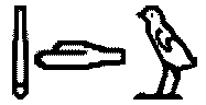
“quail chick” and “hand” and “owl”, which together are a rebus, communicate the sounds that make up the spoken word “tongue”. Rebuses can really work for communicating words, and the ancient Egyptians really did understand the word “tongue” when they saw these three icons. (The three icons connote consonants m, d, and w which spell out the ancient Egyptian word “tongue”.)
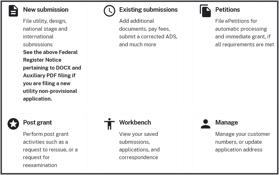
Let’s suppose you were the gifted and creative Patentcenter developer who got it into your head that icons needed to be given to the six “action items” that appear on the main page of Patentcenter. The six action items are:
-
- New submission
- Existing submissions
- Petitions
- Post grant
- Workbench
- Manage
Here are the six icons that our gifted Patentcenter developer selected for these six action items. I defy you to match up the six icons with the six action items. But, to make it easier for you to match them up, I have provided the “alt-text” (metadata that is provided on the web page with the icons to be read aloud for sight-impaired persons) for each of the six items.
| icon |  |
 |
 |
 |
 |
|
| alt-text | accessibility | description | file_copy | person | schedule | stars |
Nothing could be simpler. Just match up each of the six icons with its corresponding text-based action item.
I am joking, of course. It is objectively impossible to match up each of these six content-free icons with its corresponding text-based action item. The Patentcenter developer actually managed what ought to be nearly impossible, namely making use of icons in a way that is more incomprehensible to the modern user than Egyptian heiroglyphs.
This would not be so bad if the insertion of the six icons into the main page of Patentcenter were victimless — if it did not cause any actual harm to the quality of the user interface. But the real situation is that the designer’s decision to insert the six icons actively spreads out the page substantially, adding expanses of whitespace. The spreading makes is so that this entire “action menu” of the main six action items on the home page of Patentcenter is not visible on the main page until you scroll down and down, “below the fold”, to reach the action menu.
One assumes that part of what explains this very poor user interface design is that the Patentcenter designers all have two or three computer screens on their desk, each of which is the size of a highway billboard. And the designers (wrongly) assume that every user of Patentcenter must surely have an equally enormous computer screen, or maybe two or three such enormous computer screens, on his or her desk.
Here, dear readers, is the actual matchup. How many of these did you guess correctly when you did your matchup?
| action item | icon | alt-text |
| new submission | |
description |
| existing submissions | |
schedule |
| petitions | |
file_copy |
| post grant | |
stars |
| workbench | |
accessibility |
| manage | person |
Please post a comment below, letting others know how many of these icons you successfully matched to the respective text-based action item. You get extra credit if you can explain in words how you matched them up. For example, you get extra credit if you can explain in words how it was that you linked up “stars” with “post-grant” or “file_copy” with “petitions”.
I wonder whether the “patent center designers” have considered the accessibility of these icons for things like screen readers. If they have maybe that is the reason that it is so annoying for sighted users, but I suspect that they have managed to make the website even more difficult for blind and/or partially sighted people to use as well.
(As you can guess, I have just been involved in holding a webinar for CIPA (UK Institute for Patent Attorneys) where we had a demonstration of how a website can be completely unusable for those reliant on screen readers)
Maybe the reason they thought they needed icons is because the text labels are wrong and misleading.
“New submission” should be “new application”
“Existing submission” should be “existing applications” or “new submission” or “new submission for existing application”
Yeah, wasted space and wasted scroll-scroll-scroll bugs me too. A user interface is about information in, information out. It is not about giving the user an upper body aerobic workout.
I completely agree with you Oppedahl.
With all of these fantastic rollouts the PTO has been doing within the past month, ye, two and three and four months [sudden stopping of e-office actions and reimplementation/DocX problems/ financial manager scrambling as if numbers change during the USPTO’s corruption process/removing docket #s from correspondence report/accessing priority documents/ETC,,,] , , I believe – wholeheartedly – they have THE INTEREST OF INVENTORS in their heart. I believe they are HERE for inventors and those who help inventors [patent practitioners and support staff], and I do not feel over the past one and two and three and four months that they are ACTIVELY doing things that will harm in any way/shape/form the people that inpart keep them in their jobs, the “good jobs” they are doing.
/whatajoke
The UI seems to have been optimized for using Patent Center on a phone…
I feel like we’re all being forced to use the large print version of Patent Center. All the extra white space means that even when maximized on my 24″ monitor, significant portions are below the fold. There’s not even a “compact” option to reduce the excessive wasted whitespace.
And, yes, those icons are ridiculous. How on earth is someone supposed to associate a clock with “existing submissions”?