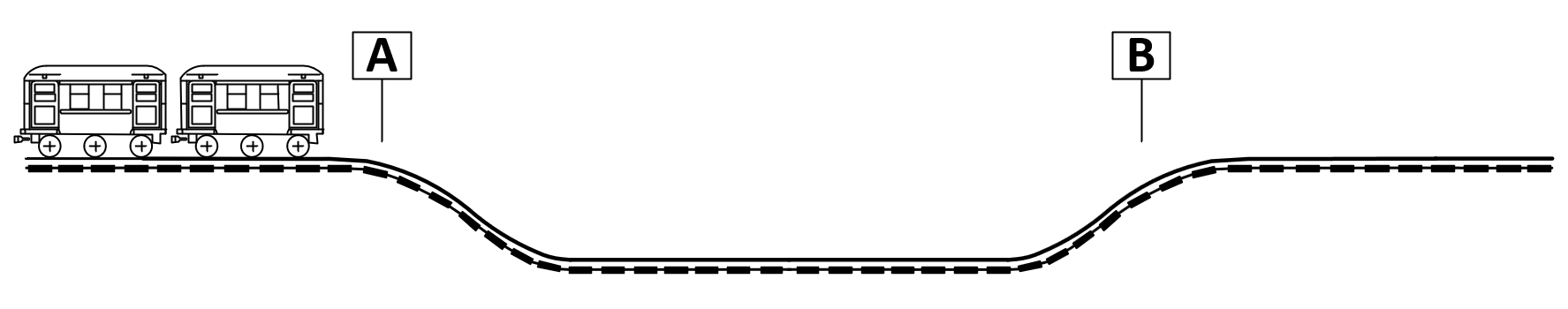
About 178 cities around the world, in 56 countries, have subway systems. Dozens of airports also have underground train systems connecting concourses and terminals. Go to any of these cities, any of these airports, and ride the subway, and if you pay close attention you will notice that if two stations are at about the same elevation, there will almost always be a contour like what you see in the figure. The train departs from station A and goes down a short decline. Then the track might be completely level for some distance along the path from one station to the next. Then shortly before arriving at station B, the track goes up a short incline and comes to rest in station B.
What follows is a rather long and rambling story ending with an explanation as to why this plaque, which looks big in the photograph but is actually not very big, hangs on the wall of my office. Continue reading “Reassuring the client”
Maybe some readers of the blog have been on tenterhooks for the past two days, hoping to hear what meal I was eventually offered yesterday on my return flight from Maryland (blog article Hobson’s choice) after attending the sixteen annual Patent Cooperation Treaty Advisory Group Working Breakfast sponsored by the World Intellectual Property Organization. The answer follows. Continue reading “Tenterhooks, or how the Hobson’s choice came out”
United Airlines recently started asking its first-class passengers a few days before the flightwhether they prefer one entree or the other. But for me it was a Hobson’s choice. Continue reading “Hobson’s choice”
I still vividly recall the first time a hotel annoyed me by charging a package fee. It was a Hyatt hotel in downtown Chicago; I was attending a professional meeting about twenty years ago. I had arranged for some courier package to be sent to me, and I had to pay a $15 ransom to get the package. Continue reading “Amazon lockers in hotels”
Poor quality writing usually only has modest consequences. In a bookstore, the consequence might be that the customer who considered buying a book puts it down and does not purchase it. In a teaching document, the consequence might be that the document does not explain things as well as might be desired, and the reader might have to read it twice to get its meaning.
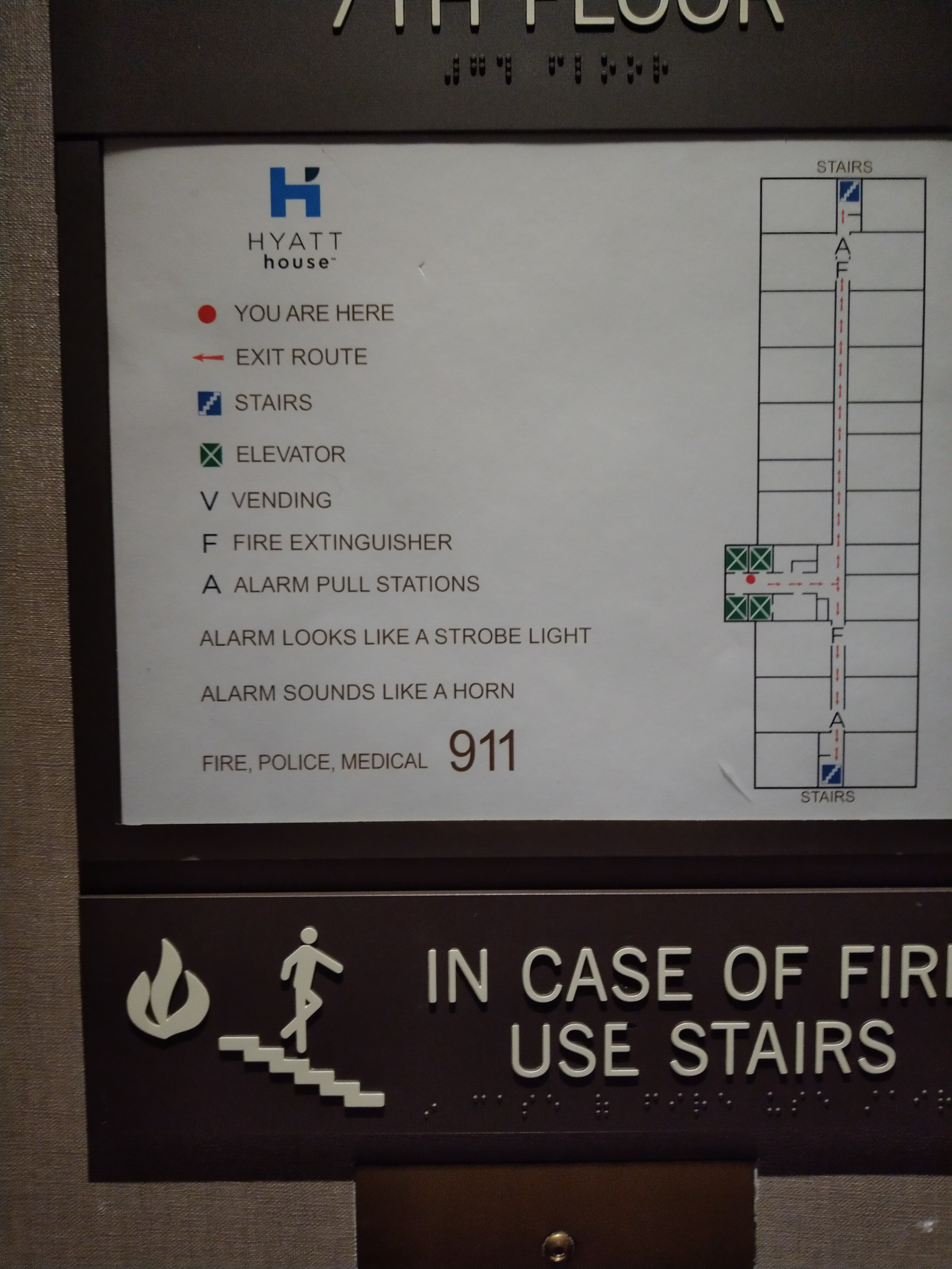
Consider, though, the possible consequence of poor quality writing in an emergency sign in a public building. Here, the writer apparently had a goal of letting deaf persons know how to know that there is an alarm:
ALARM LOOKS LIKE A STROBE LIGHT.
The insertion of “looks like” needlessly adds a qualification that makes the reader wonder something like this:
Well, I wonder why they said this? I guess it is not actually a strobe light but in some way it merely “looks like” a strobe light. Do they mean that it is shaped likea strobe light or is encased in a clear plastic lens like a strobe light but is otherwise in some important way different from an actual strobe light?
I respectfully suggest that the writer could have saved everyone a lot of trouble by coming out and saying it rather than beating around the bush:
ALARM IS A STROBE LIGHT.
Better yet, the writer could have skipped completely any assumption that the reader already was familiar with strobe lights or, more particularly, that the reader knows what a strobe light “looks like”. The writer probably really should simply have said
IF YOU SEE A VERY BRIGHT FLASHING LIGHT, DO X.
We can also look at the sentence:
ALARM SOUNDS LIKE A HORN.
Once again I suggest the reader is unnecessarily forced to second-guess along these lines:
Okay, so I am hearing a horn. It cannot be the alarm, because they said the alarm merely “sounds like” a horn rather than saying that the alarm “is” a horn. So I wonder what is being communicated by this horn?
Better would have been to say:
ALARM IS A HORN.
or better yet:
IF YOU HEAR A VERY LOUD HORN, DO X.
How would you have worded such a sign? Please post a comment below.
My favorite travel router these days is the GL-AR750 (pictured at right). I used to go through travel routers at the rate of several per year, but this one has kept me happy for more than a year now. In this blog post I will list the functions that you might look for in a travel router and I will describe how this router does at those functions. Continue reading “My favorite travel router these days”
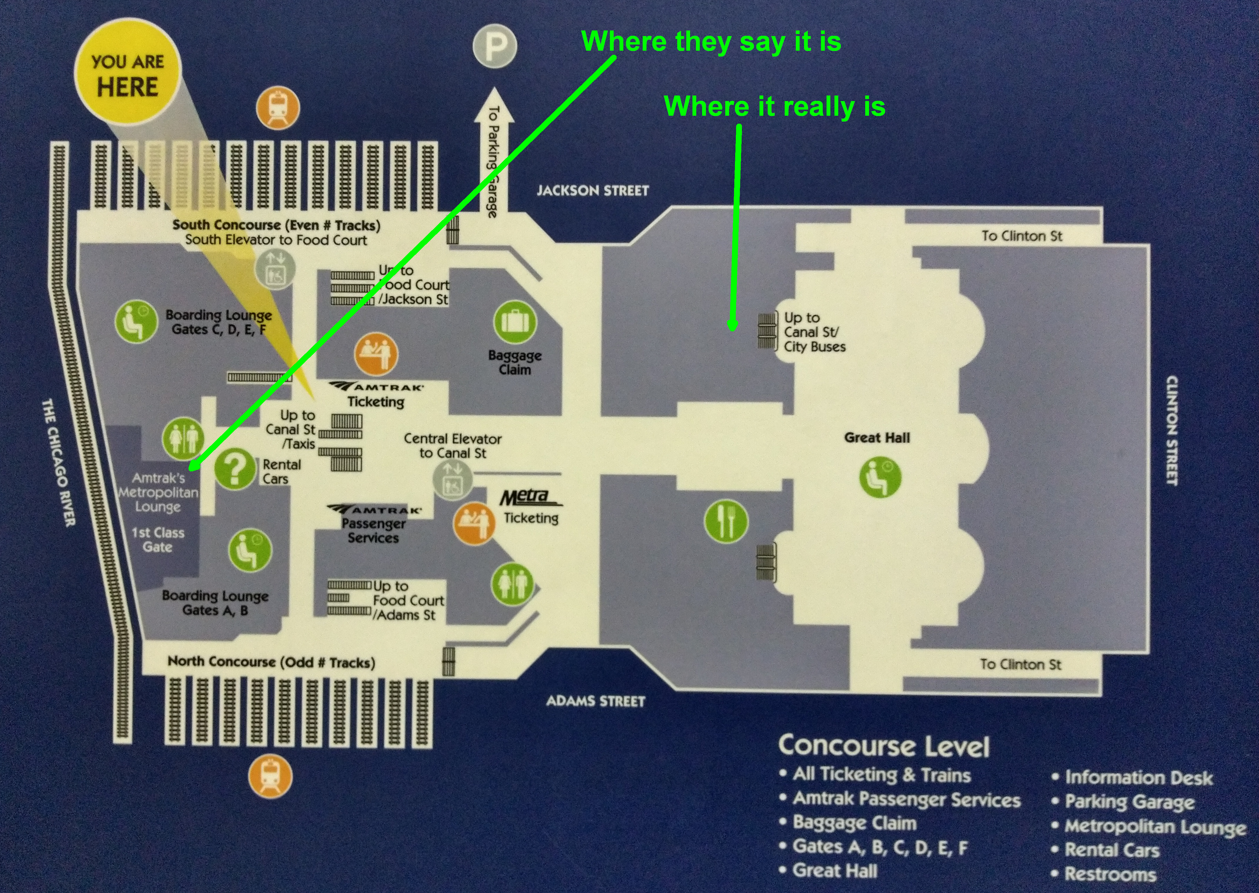
I recently had reason to connect from one Amtrak train to another at Chicago’s Union Station. The type of ticket that I was traveling on gave me access to Amtrak’s Metropolitan Lounge in that train station. My layover was about five hours so I was really looking forward to finding this lounge and taking it easy for a while. I disembarked from the first train (the California Zephyr from Denver) and found a helpful map (at right). And promptly got misdirected. Continue reading “Bad signage at Chicago Union Station”
 Maybe some readers of the blog have been on
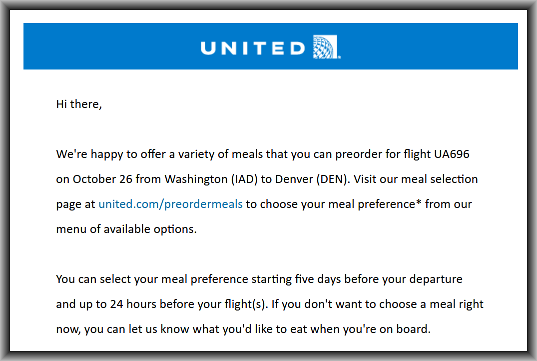
 I still vividly recall the first time a hotel annoyed me by charging a package fee. It was a Hyatt hotel in downtown Chicago; I was attending a professional meeting about twenty years ago. I had arranged for some courier package to be sent to me, and I had to pay a $15 ransom to get the package.